Just another Coombe Media group...

...we're working our way up there~

Our coursework is officially over and done with. All that's left is the teachers marking it and sending it off, and then our exam in June. We just thought we'd leave a message thanking everyone who've helped us - Emily, the teachers, our parents, the owners of the locations, and just generally the people who let us steal their time just so we could get feedback over and over again. Thankyou so much for helping us along with this project.

We also want to tell you that we've learnt so many things from this month long experience. From year 12 when most of us had barely even picked up a camcorder or sat at a mac. To now, where we can get people on screen to lip synch perfectly to something they're not even singing, where we manages to do these super cool edits like split screens and cross dissolves, and where we realise that those 20 minute long walks down a road so we can shoot someplace are actually worth it.


Since it is our last post, we thought we'd share some of the photos we took that made it so fun while making the video, but that we didn't necessarily actually put in it:


So now finally, from all us in this last entry, thanks for following us on "Just another Coombe Media group." And if you just happen to want to see the fruits of our hard labour, check it out on youtube here. (note: the video is very bad quality and at times out of synch since we had to compress it, but hopefully we'll soon put up the better version soon)

- Adam, Sarah El, Sarah Ev, and Sammy

In the lesson today the class watched our video and made comments on the areas which they liked and they thought worked well and also made note of the things they didn't like, and felt could have been improved. Examples of responses to our video included:

"I liked it when she says 'Sunk so low" the representation of the lyrics through the action of her sitting down worked well"
"The mixes using the spinning parasol were in keeping with the genre"
"The framing of shots is beautiful especially the lying on leaves shot and the editing of the two close ups on opposite sides of the frame as if she is singing to herself"
"I was a little confused over the flashback sequence and why no-one was in the church"
- Ms Hafenrichter

A lot of the positive feedback was on commenting on the choice of costume, and people thought that our edits were in keeping with the pace of the song, we noticed that a lot of people seemed to like the 'spinning shot' as they felt that is suited the video and fitted really well.
The choice of the location was also one of the areas which recieved a lot of positive feedback, as well as the mise-en-scene, especially the colours of some of the particular shots such as the ones including the leaves, as they felt the colours matched the song.

There were mixed views when considering the casting, some people felt that she suited the role, however others believed she did not necissarily suit the role of the artist. Another suggestion which we had from our feedback was to put some more work into the make-up used on the artist, this is so that she is able to be as attractive as possible, and as a result, want to watch the video more and more.
One comment which came up was that they felt that there could have been more narrative used in the video.Despite the fact that we did include a narrative in the video, feedback suggested that it wasn't always that easy to follow, and so if we haad put some more thought into imporving our narrative we may have been able to create our music video with some more narrative included in it.
Although comments on the choice of location were fairly positive, people felt that we could have used more lighting inside the house, as the picture looked a bit grainy, a problem which we could have avoided if we had used the lighting kit available.

However, overall there was a lot of positive feedback, as well as negative feedback, which we will take on board and consider in detail when we analyse our video and see how we could have imporved it, as well as what we managed to do well while making our music video.

- Sarah Evans

Today we presented our evaluation. Here's the presentation which we gave.


The on-screen presentation was supported by our group talking. We covered conventions, artist, institutions, ways we used the web and intertextuality to promote our artist (i.e. the site and the digipak), and general technology we used during the project.

The teachers filmed us doing the presentation so the examiners could get a sense of who we were as students and if we really understood our music video. Being filmed made us feel a little jittery so we ended up rehearsing a couple of times beforehand, just to make sure we knew what we had to say.

Nonetheless, in the actual presentation, we of course ended missing things out but also put in other things that we remembered on the spot. All in all, we felt we did okay.

- Sarah El-alfy

Here a the panels:


(The front of the digipak. I changed quite a few things on this picture. First of all I put on a slightly red filter, then worked on changing the saturation, also making them more red. I blurred the background - the forest trees, so as to make sure that the main focus of the cover was Emily. I also made the lighting much brighter and harsher to emphasise the beautiful colours of the autumnleaves.
In reality Emily's eyes are lighter but the photo had made them darker, so I used the lightening brush tool to go over her iris to to make it lighter. I also tried to make her lips darker [since during the filming the lipstick had worn off by the time we took this photo], so they stood out on her ivory face, making the close up that much more dramatic. When looking at the photo herself she thought that her spots and her teeth made her seem unattractive, so I airbrushed the spots out, using a cloning and blurring tool, and whitened her teeth slightly which also contrast stongly with her red lips. I also added several strands of hair infront of her face just to make her look windswept and indeed feeling like she has "fallen."
Finally, the title and the name were in a curly font, which we thought was important to have to fit in with the feminie and fantasy-like theme. I had to make a white shadow just so a viewer could see the writing more clearly against the colourful background.)

(The back panel of the digipack. I similarly tried to make the image more 'warm' with filters and light changing. I had to keep tracing around the floor, being the most 'dullest' part of the photo, and adding quite a deep red filter to make it look better. The lightening here was darker on edges, while I lit up the actual objects.
I traced around Emily's dress and shoes, unlike the rest of the picture, and made it very light and took away all colours - trying to make it almost glow, and help connotate her innocence and purity.
I ended up cropping the right side if the photo, and having her left side seem more bigger, pushing Emily to the right, so the track would look better.
While adding the copyright information at the back, I had to being out one of my own albums that I owned so I could structure it correctly. The bar code was taken off here, and you can probably notice the absemce of number beneath, since we didn't want to unintentionallytake someone else's barcode number which might not be allowed. The logo was cut and pasted on from the site.
The tracks were done in the font "Lucinda Handwriting" and the numbers are in "One Stroke Script." The numbers were chosen purely because they could be seen clearly in that font. The track titles we had to think about more carefully. In the end, I blurred the area behind the track listing, which allowed us to have the font we wanted since the out of focus background leaves the viewer able to read the tracks. We wanted a white font so that something else on the panel was white, going with the dress.
Finally, the same changes that were done on Emily's face on the front cover, was done here but on a smaller scale and with less care since her face is not seen that clearly anyway, and is not the main focus on the picture.)
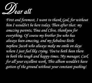


(The first page of the 'thankyou' page. Here I just put up a blank black page, and used several text boxes towrite down her message. We know straight away we wanted some sort of curly, fancy writing to fit in with our fantasy-like theme, we were going to use "Lucinda Handwriting" or "Vivaldi," however they were both hard to read in that size font. In the end I downloaded a font from here in the curly section called "jiggle" which we all agreed looked good.)
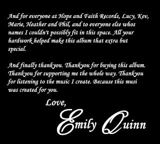


(The second-page of the mini booklet - it did end up running on to 2 pages. The main blocks of text are same as the first page, as are the letters on Emily Quinn's name, except for the E and the Q, which I used "Palace Script MT."
The change in size font was done since we thought it would emphasise that in the end, this whole project was for and about Emily. It also gave it a signituare like look, making it more personal from Emily to her fans.)
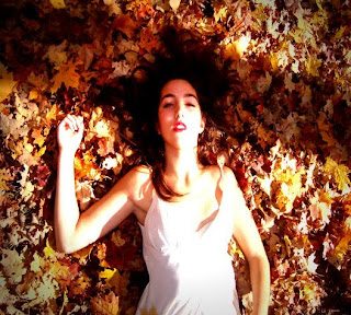


(The middle slide, and the picture we chose was this one and not the other one where Emily was standing behind the tree, was because it went with the leaves picture that would be behind the CD holder - it would seem as if that is where she was lying before, but now she is gone.
Here I used the exact same effects as the levaes image, so as to try and make them as similar as possible to try and give the effects which I have just mentioned above.)


The images, including the one beneath the CD's transparent plastic place holder, which is also the background of the website and from a scene in the 'Fallen' music video, hopefully whows that we've really thought how we need to try and make it intertextual, that they all need to promote the same artist together.


- Sarah El-alfy


We've finally begun the last tasks of our courseworks. The digipak and the website are almost done, and we've begun our presentation for our evalutaion. Hopefully we'll be done by the Christmas Holidays.

- Sammy Little

Today we finished putting all the footage together for the music video, but we still aren't very happy with the end of the video. Next lesson, we'll hopefully have time to fix it up and try to put the scenes in synch with the music better. We also went through the video several times to see if anything didn't quite fit with the flow or if we could better any transitions, changing a few things as we went.

- Sarah El-alfy

In our lesson today we started putting together Emily's website. We updated the photos, gigs and the music page.

We also went back to our music video to add a few touches to our latest footage, we added the sepia effect to our church scene to add more clarity to the fact that it is in the past and we are very nearly finished.


-Adam

Part of our coursework is to create two of the following:

- Digipack for CD
- Website/ MySpace/ Facebook page for the artist
- A magazine advertisement for the CD

Our group has decided to do the first two, and today we created the basics of the website with webs.com. The site is called : www.emilyquinn-music.webs.com. We have made it so that there are pages for certain things such as 'videos' and 'music' and of course 'home'. The actual site has been modified from the template to fit with Emily's image and genre. We will later on be actually uploading and putting things up on the site to finish it, including the music video when it is done.

-Sarah El-alfy

We uploaded all of the footage which we filmed in the church. Then we continued to edit the film, with the new footage.

-Sarah Evans

Today we went to shoot some footage at New Malden Christ Church. We wanted to film here because we have storyboarded an idea of having a flashback sequence in our music video, we want it to look like a rehearsal wedding where Emily recieves the bad news of her fiance not coming. We filmed for about an hour and tried to film the song sung with a different emotion each time to give us more footage, we also filmed Emily walking down the isle happily in the flashback and again but sad and in the present day to make it appear she is re-visiting and remembering the sad time (we would like to fade these clips together).

Filming was very successful and we should be able to use the footage effectively, however if we were to film again in a church we will have to remember to consider lighting (stain-glass windows are not the best type of window to provide lighting!). Also, Emily forgot her other dress, which makes us worry that the narrative will be slightly confusing with the changing story.

-Sammy

We've now edited about 2 minutes and 40 seconds of the video. I think we've successfully used most of the locations we were planning on using, although at the same time we cut out some locations thinking they weren't really fitting with the rest of the video.

However, as we are planning on shooting some more footage again, it looks like we might be playing around with what we've done so far later on, to accomodate the extra footage.


Regarding the digipak, I have been playing around with the images to try and get the final result that we all want. Since we want a warm image, I've added a red sort of hue, and made the background darker while trying to keep Emily light. Hopefully I'll be done soon, and will post them up here.


Also, we were wondering whether it would be best to leave the side with the CD blank/black/a colour that fits with the autumn theme, or actually have a picture behind it. At the end of the disccusion, we decided that a simple picture would be best, and it also had to fit in with the other sides. In the end we chose something that we had actually taken while joking around while filming, but we thought would fit nicely.


We actually already changed the original picture here on Ulead together, by simply adding a light red filter on it and making the lighting softer while we made the focus harsher, so the sunlight on the middle of the leaves almost seems like it's glowing. We considered blurring the picture, but then our eyes hurt to even look at it, so we left it at this. The result is what we hoped for: a warm feel to it, but the edges are fading into black, hopefully giving a sense of darkness out of the picture that the viewer can't see.


-Sarah El-alfy

We managed to edit to about 2 minutes and 20 seconds which is over half way through the song! We discussed more shooting and found out Emily is going to be very busy and we'll only have a morning to film in so it will have to precise, planned and brief.


As I'm sure Sarah has mentioned while she's been blogging, she has been working on the digipak. Today we decided on the rest of the sides that need filling. We thought to make it more personal from Emily to her fans, we would have a thankyou page from her. This may or may not spread over two pages. If it does we will use this image for the final slide:


If the thankyou page does not go for two sides we'll also use, this image:


Both the picture are actually stills from the footage we took while filming for the music video. However, the second picture is from a scene that will probably not make it into the final video. The image is also blurry, but Sarah has reassured us that she can fix that. We collectively decided what the sides would all look like, quite warm and autumnal, to stick to the themes we've gone by so far, and to also promote Emily's personality as a warm and fun person.

-Adam

As we are progressing through the song, we are finding it hard to find footage which we felt would actually fit with certain parts of the song. We also thought we might need an element of narrative in the music video, but even if we tried, the video is becoming a little repetitive.

To overcome this issue, we felt we needed to film some more footage. We began discussing what and where we could film, and whether or not Emily would be available to film again. We all agreed that we needed to include something which would keep the audience engaged, and want to watch the video. As when completing our research we found that many videos may need to be viewed more than once for the audience to fully understand the narrative and so they will want to watch it more than once in order for them to gain a better understanding of what is happening in the video. We liked the idea of filming in a church and so discussions into whether or not this would be possible and whether or not it would fit into the song began.

-Sarah Evans

We are continuing to edit our music video, we have made great progress so far and if we continue to edit in the same way we should soon have a sucsessfully completed music video.

-Sammy

We continued to edit again, getting up until 1 minute and 48 seconds.


We also thought some more on our digipak. We went on this site and used their template for 6 panel digipak ( Design DIGIPAK6P-TR ), although we will be having our CD holder in the middle of the front 3 sides rather then the right.

This means we'll be needing a main front image, and a main back image with the tracks, as well as the copyright information and record company logo. We found Hope and Faith's logo on their website, which we will hopefully be able to copy and paste onto our own CD pack. We still need to decide on what we will have on the rest of the 3 sides, the two that open up on either side of the CD and the side next to main covers. We've got the main pictures that we want to use and work with, which I've uploaded below:

(front)
(back)

As I am the one who is most familiar with software editing images in the group, I'll have the task of actually converting the photos into our ideal covers. I'll probably be using be Ulead Photo Express and Photoshop in the CS4 package. Although I would like to use Photoshop only, I know that I've been using Ulead for longer and know how to do more with it, so it'll be sensible to stick with for our coursework.

-Sarah El-alfy

We had a good day of editing we managed to edit up to 1 minute and 24 seconds without too much hassle.

-Adam

We continued to edit our video, we have now managed to complete 40 seconds of it.

- Sarah Evans

We have continued editing and have reached 34 seconds in our music video.

We were looking through our plans for a CD digipak and created some stills from our video which we thought would look effective, we took into account the layout and dimensions of the picture in the frame so that we had enough space to add in the titles, barcode, etc. We made a couple of drafts that we thought we could use as a CD front and back cover, that went along with the theme of our site and music video. We had to keep in mind that they all were promoting the same thing, .i.e. the same artist to people who would want to buy her music.

We also had to keep in mind that it would be a 6 panel digipak, which meant that there were going to 3 sides, and 3 sides, and we had to fill them all up somehow, except for the middle of he front of 3 sides where the CD place holder would be.


-Sammy

We edited about 20 seconds out of the four minutes, which caused us to realise that it takes a lot of time and patience to get things right. We worked the hardest on getting Emily's lip synching exactly right, as we didn't want her to be ahead or behind of the singing. This proved to be quite difficult as it seemed that while actually filming, Emily did not sing in exact synch. But we managed to find footage where she had done well.

-Sarah El-alfy

Today we finished uploading our footage and started editing it all. We managed to get up to 9 seconds in the lesson, we had a tough time putting in short fade out and fade ins to go in time with the music but after a lot of patience and trial and error we did it.

-Adam


Where words fail, music speaks ~ Hans Christian Anderson